Sayo Oladoyin
Game and Level Designer

Ubisoft Next Level Design 2026
Reinfeld Conservatory
Reinfeld Conservatory
Top
10
the design challenge:


Design a linear level for a Third-Person Stealth Action-Adventure game, set in a grounded/realistic world.
Project details:
Project Duration: 4 months
Team Size: 1 person
Platform: PC
My Roles: Sole Level Designer
My responsibilities
-
Made a Mission Design Document (MDD) for the level, outlining the map, objectives and level beats.
-
Developed a blockout in UE5 based off the MDD, transferring the design from a 2D to a 3D space
If you'd like to play the build, or download any of the documentation,
Check out the project's itch page!

Design Process Summary
Mission Design Document
When developing the MDD, I:
-
Took notes to ensure I fully understood the design challenge
-
Brainstormed possible solutions
-
Got real-life references to better visualize the space I was looking to create
-
Drafted out and iterated on a map based off of these ideas in Adobe Illustrator
Level blockout
When blocking out the level, I:
-
Worked in Unreal Engine 5 to translate the 2D design to a 3D space
-
Paid close attention to metrics when building the level, ensuring pacing and spacing felt good at every part of the level
-
Used a modular kit provided by Ubisoft to build the level
-
Fixed bugs and scripted custom features using blueprints to better support the gameplay experience.
Click on the boxes to learn more, or
scroll for more details
Before I could start could start making the level, I needed to ensure I properly understood the design challenge, then brainstorm the best possible solutions to the challenge.
To do this, I employed divergent and convergent brainstorming, so I could come up with as many ideas as possible, then narrow down those ideas to the best possible one.
i did this twice, following the double diamond model, allowing me not only to narrow in on making a conservatory, but also on what kind of conservatory I wanted to make.


A document from the brainstorming session I had. Although it was done solo, it was still very helpful to write out my ideas and decide on a final idea visually. I ended up choosing conservatory over observatory because I enjoyed the possibilities the conservatory provided more.
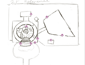
Once I had decided on a direction, I decided to look to the environment around me to get some real-life references to support my design.
Although I find that finding references online is a good option when it isn't possible to see a place in person, I find it's always best to visit references in person when possible to really get a sense of the feel, scale and atmosphere of the space.
Because of this, I visited Allan Gardens conservatory and Centennial Park conservatory to get some references.
Once I had gathered references, I was able to gather and organize them in a document, choosing which ones i wanted to inform my design. This was the second converge - diverge in this design's double diamond.


The references I gathered, a mix of images found online and in-person, organised into sections to help me better visualise the level. I was also developing the story alongside the references, so the two were helping inform each other.

Gathering all the references led me to the next step, which was diagramming. At this point I had a general idea of what I wanted the premise of the level to be, but I wasn't sure yet of the moment-to-moment gameplay.
I made a few different diagrams, alongside a program, to better flesh out the moment-to-moment gameplay.


A beat diagram illustrating the level's moment-to-moment gameplay.

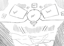
A bubble diagram I made to illustrate the relationship between the spaces that were going to be present in the level.
These spaces did change later on, as I developed the level further.


A parti diagram to help me visualize what the overall scale of the level would be like, as well as what the connections between spaces would look like.
Using the diagrams and reference I had gathered, I was able to make a few sketches to start planning out how the space was going to be organised. I went through several iterations of sketches before landing on the final one, getting feedback along the way, and cutting out dead space, unclear organisation, and other problems that popped up during the design process. I made my sketches using Adobe Photoshop.
1st Iteration

3rd Iteration
2nd Iteration


5th Iteration
4th Iteration
Once I had landed on a sketch I was comfortable moving forward with, I created the maps for the level using Adobe Illustrator. I made sure to be conscious of spacing, pacing and player guidance as I mapped out the level.


Exterior map

Interior 1st Floor Map


Interior 2nd Floor Map
After making all the maps for the level, I compiled all of them into a document explaining what my design was, what gameplay would look like, any new gameplay ingredients I added, and what the narrative supporting the gameplay was. This all went into the Mission Design Document I submitted to the competition.
Feel free to flip through the final document:
Application is no longer available.
I started out this phase of the competition by greyboxing the level I had designed in the previous phase. I translated my 2D design to a 3D space.
After the first phase. I received a good amount of feedback from the judges, namely:
-
The exterior areas featured a lot of open space that could be enhanced with smaller gameplay elements to maintain engagement and pacing.
-
Consider adding more interactive or navigational features to break up large empty zones and guide player flow more effectively.
Changes I made in response to this feedback include, but aren't limited to:
-
Adding more elements to empty areas, which I initially did by adding a garden to the empty space around the back of the level, but later reworked the level's layout to make better use of the space.
-
Adding more interactions, environmental storytelling (like a dispatcher NPC and notes and clues around the level), and platforming elements to help break up gameplay.
I made sure that the feedback I got informed design decisions I made throughout development, not just the changes I made right after receiving the feedback.
In addition to ensuring I implemented these changes, when greyboxing the level, I made sure to pay close attention to the provided metrics. Metrics had already been measured and documented by the Ubisoft team, so I made sure to refer to them throughout my greybox process to ensure the level was playable, and that the spacing facilitated good gameplay.

Screenshots from the level after the initial blockout


Once I completed the initial greybox, I submitted it to Ubisoft for the mid-phase check in. From this check in I got some more feedback, based on the initial greybox, including:
-
Ensure sufficient player guidance is provided through mission structure and directional cues so players understand where to go, why they are there, and how key items are intended to be used.
-
The reliance on a single ladder as the primary entrance feels restrictive. Consider adding an additional ingress route to enable early player choice.
-
The scaffolding looks visually solid but currently feels too narrow and constrained. Try expanding on them a bit and make it a bit higher to give a sense of height and scale. This area has the potential to offer interesting gameplay opportunities if developed properly but currently the impact is neutral at the moment.
The following are some of the changes I made in response to the feedback given:


Added missions for the player to complete, giving them more guidance through the level, and added lighting to guide the player.
Added a second entrance to the level, giving players choice from the get-go.


Expanded the part of the level with the scaffolding, making it more grand and a more interesting introduction to the level for the player.


Once I had implemented the feedback and completed the greybox, I ran some playtests.
The purpose of these playtests was to ensure that the level was being experienced by the player the way I had intended for it to be experienced. Playtesting helped me see a lot of issues my level had with player leading, sightlines and the overall gameplay experience.
I ran my playtests mostly in-person, providing players with a post-playtest survey to complete afterwards. This meant that my findings from the playtests were a mix of observations I made while players were playing through the level, and feedback they gave through the survey.
Some of the questions I asked included:


How was your experience navigating the scaffolding at the centre of the dome? Do you have any specific highlights or pain points?
How useful did you find the dispatcher's message at the very beginning, on a scale of 1-5 (1 being not useful at all, and 5 being very useful)? Explain your choice.


How effective was the foliage as cover in the greenhouse?
Which key did you go for? The key in the greenhouse storage room, or the key outside in the shed? Why did you go for this key?
I made sure, when formulating these questions, to make them specific, non-leading, and easy to understand. I wanted to pose questions that would get as close to extracting the player's actual experience with the level as possible.
Once I performed the playtests, and received the data, I analysed it and came up with takeaways to move forward with based off the data. These takeaways included:


Add more labels and information around the level, to make things even clearer for the player, and adjust the lighting and sightlines around the elements that are already there, to make them more effective.
Spread out the scaffolds, and make them a bit smaller to prevent them from feeling cramped.
Add lighting to and adjust the locations of both entrances, to make finding an entrance into the level easier.
Once I had come up with my takeaways, I implemented the changes into the level.
Throughout development, I made sure to fix any bugs I found in the project left by the organisers (we were told that bug fixing was a bonus, and some bugs were put in on purpose), as well as adding in my own custom features to make gameplay more engaging (this too was encouraged, but not required).
An example of a bug I fixed:


Guards were still detecting the player after they had been eliminated, leading to errors.
I created a variable "Is Dead" that becomes true when the "Dead" custom event was triggered

I made sure there was a check to make sure that the guard was actually dead, before it continued to perceive the player.
As for custom features, for this project I made many, but the one feature that was most pivotal for gameplay was the tall weeds. This was a new gameplay ingredient I added to make the stealth gameplay more interesting, and thus I had to program it from scratch. It works by allowing players to crouch inside tall grass blocks, keeping them hidden from guards as long as they remain crouching, and were not detected before entering the tall grass.
The functionality is as follows:


First the blueprint checks if the player is colliding with it. If they are, "player in weeds" is set to true.
If the player is crouching, and is in the weeds, player hidden is set to true.

If the player leaves the weeds, player hidden and player in weeds is set to false.

Inside the Blueprint controlling the guards, I added this code to check if the player is hidden in the tall weeds. If they aren't, the guard detects them as normal. If they are, site is unregistered, and the guards continue to patrol.
Once the blockout was complete, I made a document describing my design process, the changes I made between the initial pitch and the final blockout, and the results I got from playtests and what I took away from those playtests and chose to implement.
I also detailed any bugs I fixed, and any code I added to the project. The document is available to view below:
Application is no longer available.
If you'd like to play the build, or download any of the documentation,
Check out the project's itch page!